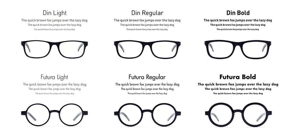


TYPE (2014-)
We were responsible for the entire design process starting with a detailed examination of each font’s characteristics and ending with the final production of the physical product design. At the beginning of the design phase, we briefed a technical designer on the fonts’ characteristics, history and design traits, and then started working on frame design based precisely on each font. We took the final design to Sabae city in Fukui prefecture, which is the biggest producer of eye glasses in Japan, in order to create the first prototype. Through a number of initial prototypes and try-ons, we adjusted the design of each frame by small increments in order to accurately represent the weight difference of each font then landed on the final products.
In addition to the functional optical aspect of glasses, glasses come in a wide variety of diverse styles. Similarly, there is diversity and variety in fonts. Even when the same text is being printed each time, a change of font can transform the way the communication feels; thus people select the most appropriate font according to an intended use and purpose. The glasses brand “TYPE” was created by focusing on this commonality between glasses and fonts.
--
Silver cube at The 93rd ADC Annual Awards, Product category
--
W+K TOKYO
Executive Creative Director: Tota Hasegawa
Art Director: Daisuke Maki
Designer: Kazuhi Yoshikawa
Account Team: Shinya Kamata, Takemi Sakaeri
Agency Producer: Shinya Kamata
Still Producer: Hiromi Shibuya
Photographer: Takeshi Hashimoto
Eyewear Designer: Hideto Moriyama (ANAMARIA)
Eyewear Designer: Ikuya Enomoto (ONLYGOODFORMS)
Product Producer: Kazuhisa Yabu
